Data Visualization: Creating Percentile Polar Axis Charts in Python

View the source code for this project on GitHub
I find the hardest part of analyzing the performance of non-forwards in football is finding a starting point. With forwards, it is easy to look at goals and assists, or expected goals and assists (xG/npxG and xA), but those are not effective gauges of the quality of, say, midfielders.
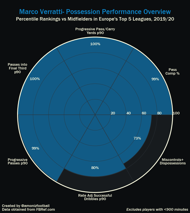
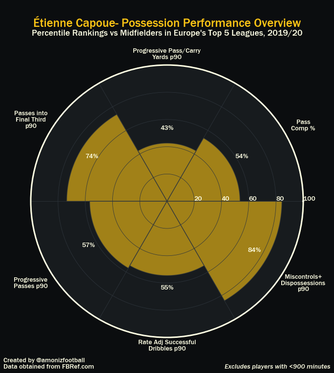
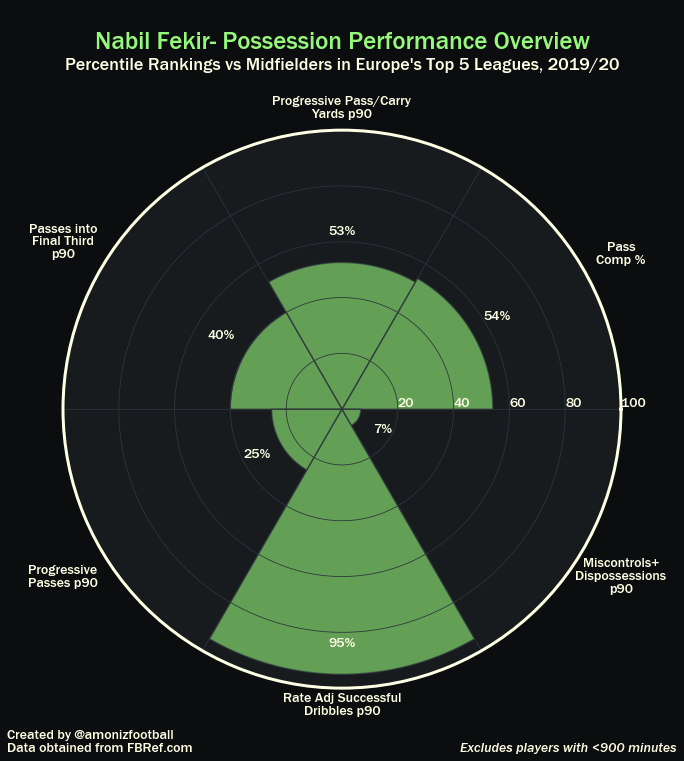
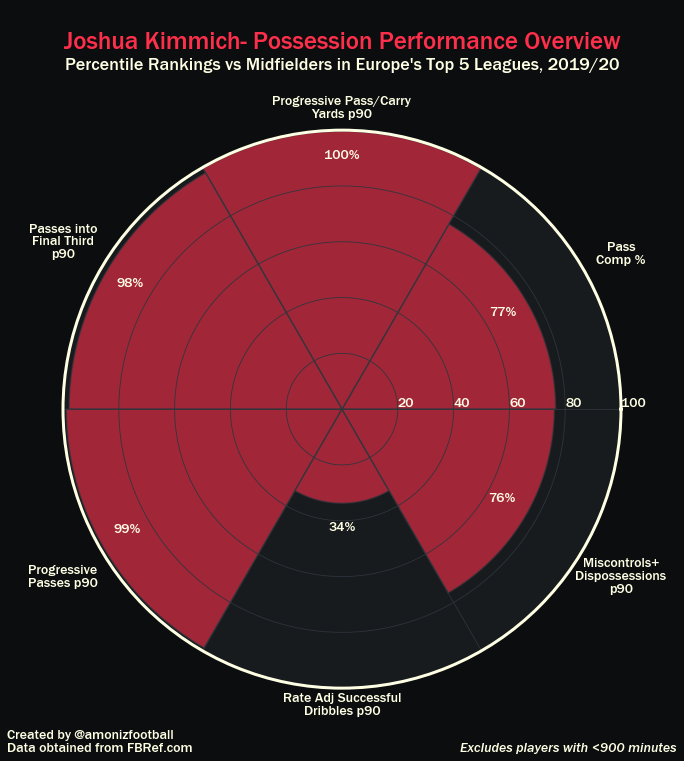
I wanted to find a way to quickly see and provide the basic performance of a midfielder to others without having to worry about explaining if particular values are impressive. Having seen polar axis charts on Matplotlib’s website before, I thought of the idea of video game-style charts like these from StatsBomb, except with percentile rankings, so even people who aren’t familiar with football statistics can easily understand:

First, I scraped FBRef.com’s database of players in Europe’s Top 5 Leagues, edited them in Excel, and loaded them into Python’s Pandas using pd.read_excel().
Then, in Pandas, I created two filters that determined the eligibility of players to be included in my percentile rankings:
- Minutes played: I filtered for at least 900 minutes played, or the equivalent of ten matches in a 38-game season.
- Position: From the minutes a player played, they must have played most of their minutes as a midfielder to be considered. I recognize that teams have tactical variations that make the idea of a ‘midfielder’ heavily debatable, but after considering that idea, I came to the conclusion that my arbitrary input of who is a midfielder and who isn’t would be less accurate than FBRef’s data anyways, so I stuck with theirs.
From there, I used pd.rank(pct=True) to create percentile rankings for every player remaining in each of the categories I wanted. In the case of looking at midfielders in terms of effectiveness in possession and ball transition, I opted for the following:
- Pass Completion %- the percentage of passes a player makes that reach their target
- Progressive Pass/Carry Yards per 90- the number of yards a player carries or passes the ball towards the opposition goal in the average 90 minutes
- Passes into Final Third per 90- that amount of times a player makes a pass into the final third each match
- Progressive Passes per 90- the amount of times in the average 90 minutes where a player makes a pass that moves the ball at least 10 yards closer to the goal than it was before the pass
- Rate Adjusted Successful Dribbles per 90- this was a statistic that I derived myself. It is the number of successful dribbles a player makes per 90 minutes, adjusted for their success rate. Failed dribbles lead to being dispossessed, and I did not want to reward players that dribble too much for low efficiency plays.
- Miscontrols + Dispossessions per 90- Includes every time a player loses the ball that isn’t a missed shot or failed pass.
I created the chart to match the template of a scatter plot style I had settled upon in Matplotlib a few days ago:

Lastly, I wanted to make these quick and easy to generate, so I customized it in such a way that I could simply type the player name at the top of the Jupyter Notebook cell and the chart would generate in seconds.
The final product, shown below, is a clear articulation of the possession profile of 504 different midfielders in Europe’s Top 5 Leagues.
Contact me on Twitter, Linkedin, or at aaron.moniz@uwaterloo.ca


