Tableau Dashboard: Rolling xG Trends of Premier League Teams, 17/18-20/21
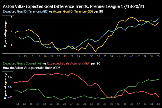
This weekend, I made an interactive dashboard in Tableau that presents a 10 game rolling average of @fbref‘s xG trends in the Premier League from 17/18-present. The dashboard allows you […]
Read MoreData Visualization: Creating Percentile Polar Axis Charts in Python

View the source code for this project on GitHub I find the hardest part of analyzing the performance of non-forwards in football is finding a starting point. With forwards, it […]
Read More

