Euro 2020 Bracket Standings
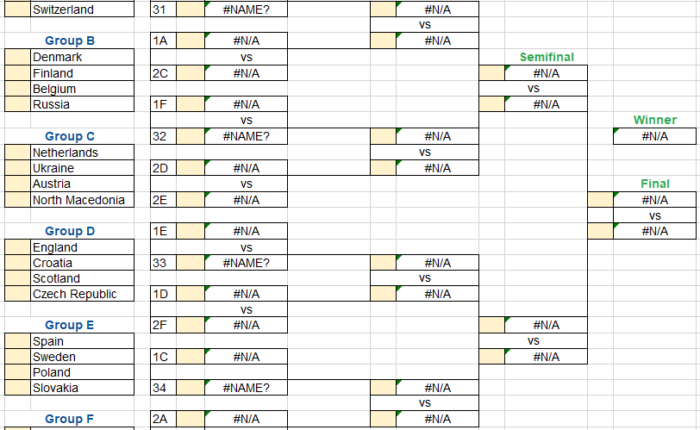
Points Awarded Thus Far The following criteria is used to establish the current points standings to date, with points total for each included in brackets: Italy: 1st in Group A […]
Read MoreEuro 2020 Bracket: Breaking down 173 user predictions using Tableau Visualizations
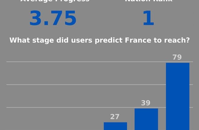
Here’s how each of the 173 users predicted each group in the tournament. Belgium were the most popular group winners, but Spain were the most favoured side overall in the […]
Read MoreInstructions to Complete your Euro 2020 Bracket

Every two years or so, a major international footballing tournament rolls around, and I create a bracket for family and friends to state their predictions and compete against each other. […]
Read MoreTableau Dashboard: Rolling xG Trends of Premier League Teams, 17/18-20/21
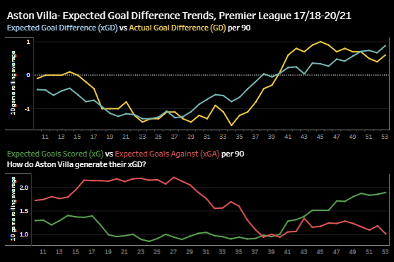
This weekend, I made an interactive dashboard in Tableau that presents a 10 game rolling average of @fbref‘s xG trends in the Premier League from 17/18-present. The dashboard allows you […]
Read MorePython Data Visualization and Video Article: Why Manchester United should not allow Sergio Reguilon to join Spurs so easily

The following thread was the result of hours of watching Spanish left-back Sergio Reguilon play for Sevilla and comparing him to Manchester United’s equivalent players. The thread reached an audience […]
Read MoreData Visualization: Creating Percentile Polar Axis Charts in Python

View the source code for this project on GitHub I find the hardest part of analyzing the performance of non-forwards in football is finding a starting point. With forwards, it […]
Read MoreData Visualization- How good are Manchester United’s defenders and holding midfielders at progressive passing and carrying?

As part of my most recent data analytics project, I learned to map coordinate data and construct arrows in Tableau to create player pass maps. I used my progress to […]
Read MoreData Visualization- Is Jack Grealish the right signing for Manchester United?

I am attempting to learn data science through my favourite sport, football, as an attempt to both understand the game at a deeper level and enhance my interest in data. […]
Read MoreData Visualization: The Truth Behind Police Brutality and Race in the United States

Ten days ago, George Floyd, an unarmed Black man, was murdered by Minneapolis police, igniting anti-racism protests around the world. The video, a disheartening nine-minutes of policeman Derek Chauvin kneeling […]
Read More

